


Photography
Quick Fix: Yellow/Orange Pictures
Tuesday, May 5th, 2009If you take your own photos, you’ve no doubt had it happen. The photo looked great in the viewfinder, or on the LCD. But when you downloaded it, it had that yellow or orange cast to it. And you may have thought, “Oh, no. This shot is ruined."
Well, that’s what we’re going to fix in this tutorial.
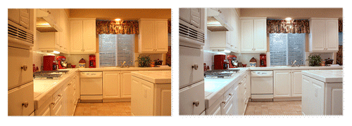
The reason the yellow or orange cast happens is simply because the ‘white balance’ was off in your camera when you took the picture. And I could get into a long discussion about color temperatures of incandescent light, fluorescent light, daylight, etc. But for the purpose of this tutorial, it really doesn’t matter. We’re just going to fix it. And we’re going to do it in less than a minute.
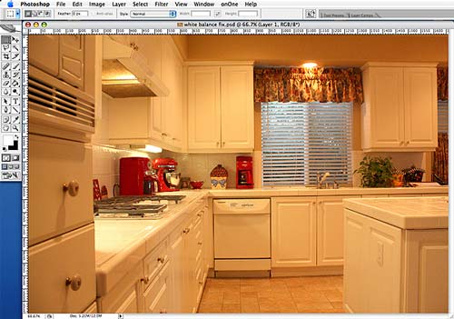
If you use Light Room, Aperture, or a program like that, there’s an adjustment just for white balance. But I’m going to be using Photoshop CS2, which doesn’t have an adjustment specifically for that. And you can do the identical same thing I’m going to show you in Photoshop Elements.
For the main photo, I picked one that was way off in its white balance, and has a very extreme color cast.
Are you ready? Let’s get started.
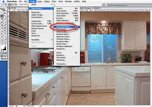
Open your photo and go to Image>Adjustments>Photo Filter.
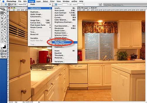
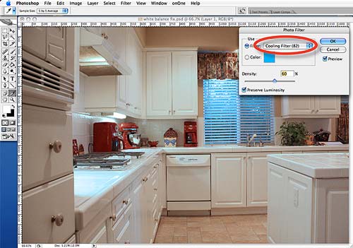
This will open a little window where you can pick different color filters. Just select one of the Cooling Filters and adjust the Density slider until your whites look white. I used Cooling Filter (82) for this one.
Once you have your whites where you want them, just click OK. That’s about all there is to it. And for most photos that may be all you need. You would be done.
Pretty simple, huh?
But as you can see in this photo, because it was so extreme to start with, adding that much of a Cooling Filter turned the window blue. So, let’s go ahead and fix that too.
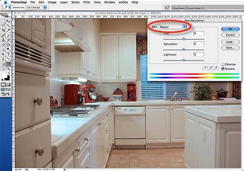
Using your Marquee tool to outline the area you want to change (in this case the window), go to Image>Adjustments>Hue/Saturation.
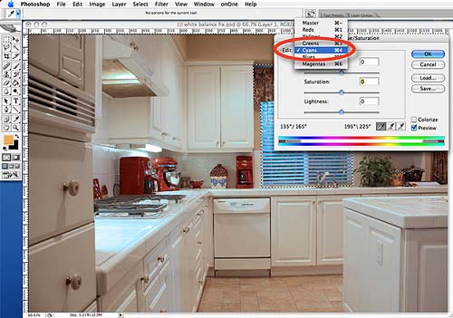
As you will see, it will open a window that defaults to Master, which affects all of the colors. But we don’t want to change all the colors, just the blue. So, click on the word Master and a drop-down menu will open, allowing you to select the individual colors to adjust.
In this case, we’re actually dealing more with a Cyan that a true Blue. So, just move the Saturation slider to the left to de-saturate that color until it looks right.
You can also play with the Lightness slider if you like. But don’t worry about the color-bars or eye-droppers at the bottom. We’ll address those in a different tutorial.
Once you get everything looking the way you want, just click OK and you’re done.
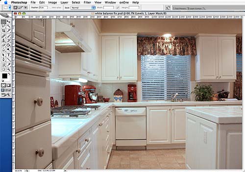
You can then go back and tweak the other colors a little more, or the brightness and contrast, or whatever you like. But for a ‘quick-fix’ this isn’t too bad – especially considering what we started with.
And when you get used to where these adjustment tools are, it can all be done in less than one minute.
Hopefully, you found this tutorial helpful. And maybe one day it will save a photo you may have otherwise thought unusable.
Quick Fix: Overexposed Windows
Monday, May 4th, 2009Ah, yes…overexposed windows. This seems to be one of the most common problems you see in many listing photos. Images where the room exposure looks good, but the windows are overexposed. Or, you can see what’s outside just fine, but the room is underexposed and way too dark. But we’ll talk about fixing that in a different tutorial.
The reason this happens is simply because the light coming through the window is brighter than the light inside the house. And if you were a professional photographer, with the proper lighting equipment, you could probably get the light better balanced for that perfect shot.
Or, you could shoot multiple shots with different exposures, and then use some form of HDR, tonemapping, image blending, layer blending, or whatever, to merge the best exposures. And I’ve seen about a zillion tutorials on how to do just it. But they all have to do with using multiple images or multiple exposures.
But what if you only have one shot, and the windows come out overexposed? Well, if they’re completely blown-out and look pure white, you may be out of luck. However, if you can see anything through those windows, you may be able to do something to make them look better. And that’s what we’re going to address in this tutorial.
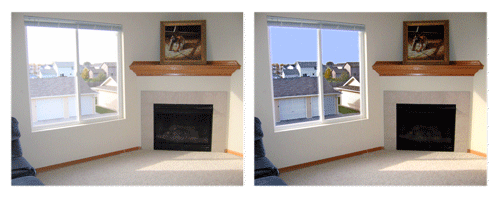
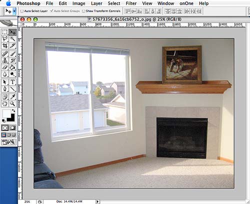
First, I picked an actual listing photo that seemed to be a pretty typical example and will serve well to demonstrate the technique we are going to use. Notice how the window is not completely blown-out, as you can still see outside. But it is definitely overexposed.
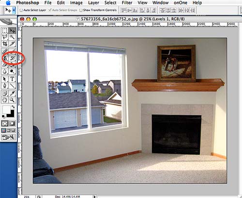
Step 1: Using your ‘Polygon Lasso Tool’ outline just the area of the window you can see through. I usually set the ‘Feather’ amount to 1-2 pixels. This will help soften the edges and blend it in.
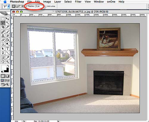
Also, you may have noticed that the selected area is actually two different sections, as there are two separate windowpanes. To select multiple areas, just outline one with your Lasso, then hold down the SHIFT key when you start to outline the next area. By holding the SHIFT key, you can add as many selections as you like.
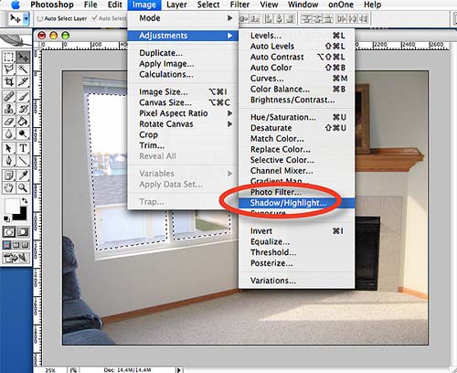
Step 2: Next, go to Image>Adjustments>Shadow/Highlight (Photoshop CS), or Enhance>Adjust Lighting>Shadow/Highlights (Photoshop Elements). It should open your control panel with default amounts set at around 50% for the Tonal Width, and 30 pixels for the Radius. Just leave those at the default amounts.
Step 2 (cont): Set the Shadows>Amount to 0%, and increase the Highlights>Amount until it looks right. It will usually end up around 80%-100%, depending on your photo. As you increase the highlight amount, you will see detail emerge through the windows.
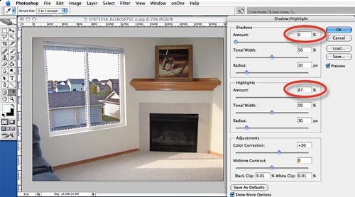
If after adjusting these settings the contrast looks off, try adjusting the Adjustments>Midtone Contrast slider until it looks right.
Just click OK and you’re done.
That’s all there is to it. You now have a nice detail through the window that was previously overexposed. As mentioned above, this technique doesn’t always work. It all depends on how ‘blown-out’ the windows are. But it’s always worth a try.
Now, if you want to take it to the next level, you can always add a little blue sky: Quick Fix – Turn Gray Skies Blue in less than a Minute.
Hopefully you found this tutorial helpful. It’s just another Quick Tip that is easy to do, and is meant to help make your photos just a little bit better.
(Note: By the way, this technique isn’t necessarily the easiest, but the Shadow/Highlight tool is a great tool to get familiar with – which is why I used it for this tutorial)
Quick Fix – Turn Gray Skies Blue
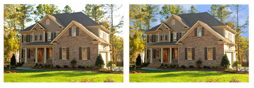
Monday, May 4th, 2009I’ve seen various articles, tutorials, and blog posts on how to fix or replace a blown-out sky. So, this topic is nothing new. However, this may be the fastest way there is to do it. And it can be done without any magic wands, layer masks, extraction tools, or even any pictures of a sky. All in less than one minute.
I’m going to be using Photoshop CS2, but there should be ways to accomplish the same thing in Photoshop Elements.
For the main photo, I obviously wanted one with a washed-out sky. But, to show how well this technique works, I also wanted one that has a lot of intricate detail – like the leaves on the trees, which can often be problematic and difficult to work around.
Okay, are you ready? Let’s get started.
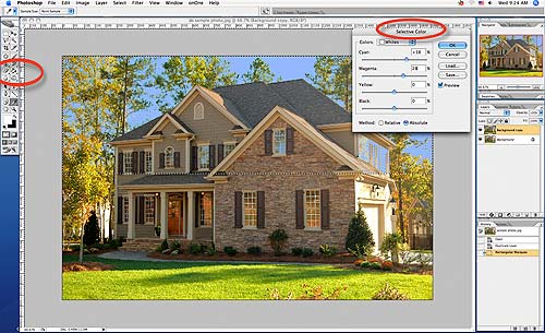
Step #1: Open your photo and duplicate the layer. In Photoshop CS2, there are six different ways I know of to duplicate a layer. But instead of going through all of them, just select your background layer and right-click on it. You’ll see the DUPLICATE LAYER option.
Step #2: Next, select your rectangle Marquee Tool in your toolbar (see red oval) and draw a box around the sky area you want to replace. If you notice the little ‘marching ants’ you’ll see I’ve selected the top half of this photo.
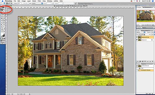
Step #3: Now, go to Image>Adjustment>Selective Color, which will open up a separate little control window. Go to Colors at the top of that window and select White. Now, just use your Cyan and Magenta sliders until you get a shade of blue that you like, and click OK. I have found that typically your cyan is going to be about 10 percent higher than the magenta to get a nice natural looking blue.
Step #4: The only thing left to do is select your Eraser Tool (see red oval on left) and erase any residual blue in areas it shouldn’t be. In this photo, you can see there’s some blue on the right side of the house that needs to be removed. There’s also some on the front windows. Now, if I wanted to have more accurate ‘reflections’ in those windows, I could always leave that blue and just erase it off the window panes.
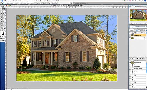
But either way, you’re done. That’s all there is to it. Gray skies turned blue in less than a minute.
However, to have thing a little more realistic looking, I created my own ‘clouds’ brush that’s now part of my permanent brush set. So, with a couple of extra clicks I can add some clouds and have a pretty nice looking sky – all without any magic wands, layer masks, extraction tools, or even any pictures of a sky.
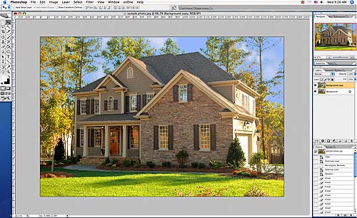
And it can all be done in less than one minute.
Screen Resolution = 72-dpi… Or does it?
Sunday, July 20th, 2008I’ve produced video, print, and online stuff for years. And I’ve always just routinely set my image resolution to 72-dpi for anything going onscreen (web or video), and 300-dpi for anything that’s going to be printed. That’s always been kind of a standard I used.
And for onscreen, it would be more accurate to refer to it as “ppi’ (pixels per inch), rather than “dpi” (dots per inch). But “dpi” came from the printing industry and people often use them synonymously – even though they are two different things. Anyway…
A while back, I was reading a blog about resizing photos for online use and someone suggested using 72-dpi as a multiplier to determine how big your photos will appear onscreen. So for example, if you wanted your photo to be 6” onscreen, just multiply 6 by 72 and you’ll see that it would need to be 432-pixels. I thought, “What a great little tip. It’s simple and easy for people to remember.”
Then it hit me. I had a V-8 moment (smacked own forehead), and thought… “Wait a minute! 72-dpi has nothing to do with how big something appears onscreen! How big is the monitor? What’s the screen-resolution set to?” Those are the things that determine how big something will appear. I’ll show you what I mean.
Right now, I’m working on a 20” monitor with the screen-resolution set to 1680×1050 (roughly 98-ppi), which means a photo that’s 432-pixels wide takes up roughly 1/4th of my screen width, and measures about 4” wide (not 6″ wide).

However, if I do nothing more than change my screen-resolution to 800×600 (roughly 57-ppi), the same photo (432-pixels wide) now takes up over half the width of my screen, and is about 7-1/2” wide.

But what if I was working on a 13” monitor, rather than a 20” monitor? The images would take up the same proportional amount of the screen, but wouldn’t be the same dimensions. They would obviously be much smaller. And if my resolution was set to 800×600 my ppi would be about 77, and at 1024×768 it would be about 98.5-ppi.
Okay, so now we know that 72-dpi has nothing to do with how big you photos appear onscreen. Nor does it have anything to do with screen resolution. What about image quality? It stands to reason that the higher the image resolution, the higher the quality…right? More V-8, please.
The more I thought about it, the more I realized “dpi resolution” has nothing to do with anything. At least, not if it’s going onscreen. Printing is a different story, but I won’t get into that now.
Here’s three different images, all the same size (405×270 pixels) but with the resolution set to: 300-dpi, 72-dpi, and 1-dpi. Yes, that is “one” dpi for the last image. Can you tell the difference? For the doubters out there, go ahead and download these images and open them in Photoshop, or whatever, and look at the resolution in the Image Size palette.

(300-dpi)

(72-dpi)

(1-dpi)
So, what does all this mean? It means that if your photos are going online, dpi-resolution has nothing to do with anything. What does matter, however, is the pixel dimensions. Well… that and a whole lot of other things. Especially, how good your photo is to start with. : )
Quick Tips for Better Photos
Tuesday, May 20th, 2008Research is showing that photography is a very important aspect of selling a home these days. If so, why is it that so many agents take their own photos? Are they also professional photographers? Let’s face it, they’re not.
We know the answer. It can get expensive to hire a professional photographer for every listing. And while few agents match the knowledge, skill, and expertise of a true professional, with a few simple tips, the quality of many people’s photos could be enhanced immensely.
Here are some very basic suggestions and quick tips that might help take your photos to the next level of quality. Tips that can help you create… A Difference You Can See.
EQUIPMENT
Camera – Let’s start with your camera. There are a lot of cameras that will work well for real estate photography, so it’s hard to pick just one. But you don’t need to spend a lot of money to get a good camera. In fact, a lot of the ‘point-and-shoot’ cameras will work fine. And it doesn’t need to have a gazillion megapixels either. One with 3-4 megapixels is more than enough for anything online, and most any printing needs you’ll encounter.
Wide-Angle Lens – It can’t be stressed enough how important it is to have a wide-angle lens. You’re probably going to want one in the 23mm-25mm range. Much less than about 18mm and your shots can start to take on an obvious “fish-eye” look, or exaggerated perspective. And much more than about 28mm, and you’re not going to see enough in the shot. But not all cameras have a wide-angle lens, nor can you put one on them. So, if your camera doesn’t have one, you need to buy one, borrow one, or get someone else to take your pictures. It’s that important.
Tripod – Many agents try to get by just doing handheld shots. And some do okay at it. But a tripod makes it far easier to keep your camera steady and eliminate potential blur. And it’s an absolute necessity for low-light situations, with slower shutter speeds. But a tripod can also be a great tool for getting difficult shots. For example, you can hold it over your head for a higher-angle shot. Or, use it to reach into a bathroom and shoot without seeing your reflection in the mirror.
Memory Cards – This may seem overly basic, but make sure you have enough ‘memory’ with you to store the photos you will be taking. Know in advance how many photos you can fit on a single memory card, and roughly how many photos you will be taking – then double it to be safe. Then have enough memory to handle it. Or, a laptop you can offload your photos to.
LIGHTING
Natural Light – There’s nothing quite like the look of natural light. And, unless you have the lighting skills of a professional, no flash can match its warmth and color. Even regular house lights can be better than a flash. So, turn on every light you can, open the blinds, the drapes, maybe even light the fireplace. But when you shoot, try to keep any direct sunlight from the windows behind you. Otherwise, it can “blow-out” your shot. In automatic mode, your camera should adapt for lower light levels, and can often do fine without using your flash at all. So, shut it off and take your shots. Then take the same shots with your flash on. That way you at least have an option.
Golden Hours – As long as we’re talking about natural lighting, an hour or two after the sun rises and before it sets can be the best time of day for shooting – indoors and out. It’s that time of day when the light is soft, warm, and golden, and can add an incredible look to your photos. It’s well worth the effort to schedule your photo sessions around these hours.
Overcast Days – Typically, you should avoid shooting exterior shots on overcast days. If you know what you’re doing, an overcast day can actually work for you and soften harsh shadows. But for most people, it just results in washed-out colors and flat looking photos. However, that same soft light you get on an overcast day can make your interior shots easier.
BEFORE YOU SHOOT
Clear The Clutter – This should go without saying, but the home should be clean before you shoot. This includes moving ALL miscellaneous items and clutter completely out of the shot. There’s nothing that will spoil a shot faster than a stack of papers sitting on the table. Or, a trash can in the driveway. Or, a pair of shoes by the doorway. Toys on the floor. Even electrical cords should be moved to get them out of the shot. Take the time to clean and clear the clutter for every picture you take.
People & Pets – People and pets fall into the same category as clutter. Unless they’re professional actors or models, they should NOT be in your pictures. The same goes for pets, and their paraphernalia. Move the birdcage, move the dog’s bowl, move the litter-box, etc. In short, people and pets should not be in your shots – regardless of what the seller wants. You’re showcasing their house, not ‘Fido.’
Photo Resolution – If you want your photos to look crisp and clear, even at full-screen on a computer, they should probably be shot at a resolution of at least 1024 x 768 pixels (.77 megapixels). And if you’re also going to print them, you may want to increase that to somewhere around 1600 x 2000 pixels (3.2 megapixels). So, before you shoot, check your camera’s menu and make sure your resolution is set high enough.
COMPOSE YOUR SHOT
Perspective – You can easily create a little visual ‘intrigue’ in an otherwise boring shot by just adding some perspective. It’s simple. Don’t shoot anything straight on. Shooting at a slight angle, or a couple of feet above or below normal eye-level, can really add nice visual depth. And depth adds dimension, which makes your pictures more intriguing and aesthetically pleasing. This holds true for both indoor and outdoor shots.
Framing – When framing your shot, or positioning the object you’re shooting in the viewfinder, a simple rule-of-thumb is to never put it dead-center in the picture. Always frame it slightly off to one side or the other. There’s something called the “Rule of Thirds,” but we’ll get into that another time. Also, make sure whatever you’re shooting is angled toward the center of the picture, or facing back into the shot.
TAKE YOUR BEST SHOT
Shadows & Reflections – As obvious as this may seem, you see pictures all of the time with the photographer’s shadow on the ground, their reflection in a mirror, or in a window. Or, you will see the reflection of their flash in a mirror or window. Nothing says ‘amateur’ faster. And oftentimes it’s simple to avoid. Just look before you shoot, and then look again after you shoot. If you can’t avoid it, you’ll need to fix it later.
Review – One of the benefits of a digital camera is being able to check every shot as soon as you take it. But instead of just glancing at it, study it. Look for all the things talked about above — shadows, reflections, clutter, and other things that don’t belong in the picture. Look at the framing and make sure you’re not cropping something that’s important. When in doubt, shoot it again.
Photo Quantity – With a digital camera, there’s no film to process, which means it’s free to shoot as much as you want. So, click away. Take multiple shots of everything. And if you know how to adjust your exposure, ‘bracket’ your shots by taking 3-5 identical shots with different exposures. The point is simply to shoot, shoot, and then shoot some more.
Shot List – A written shot-list is a great tool and is easy to do. Not that it will make your pictures look any better, but it can certainly help in organizing them. When you’re taking your pictures, just jot down exactly what you’re shooting and any related details that aren’t readily evident. For example: new carpet or custom drapes, appliances that stay with home, wood-burning fireplace, etc. Not only will this help you recall the room you were shooting, it comes in handy when highlighting specific features.
CONCLUSION
While these are just a few basic tips to help make your pictures better and the process easier, we hope you at least found something that was a good reminder for you, or something you can put into practice immediately.
Check back often, as we will be providing move detailed tips and tricks to shooting better photos.


